网站部署TypechoHandsome 主题大升级(二)CSS
Mz Xi主题整体细节设置以及美化方案
Handsome主题后台-外观-设置外观-开发者设置-自定义CSS处
自定义CSS
该修改项位于Handsome主题后台-外观-设置外观-开发者设置-自定义CSS处
部分提到PJAX回调的部分添加到主题后台-外观-外观设置-PJAX-PJAX回调函数内
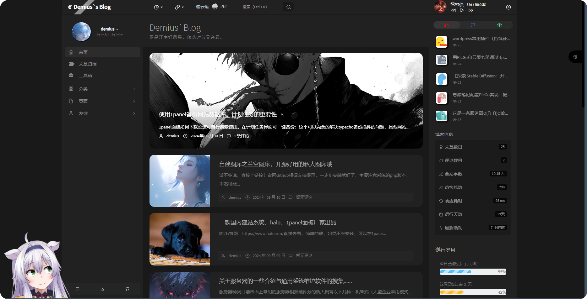
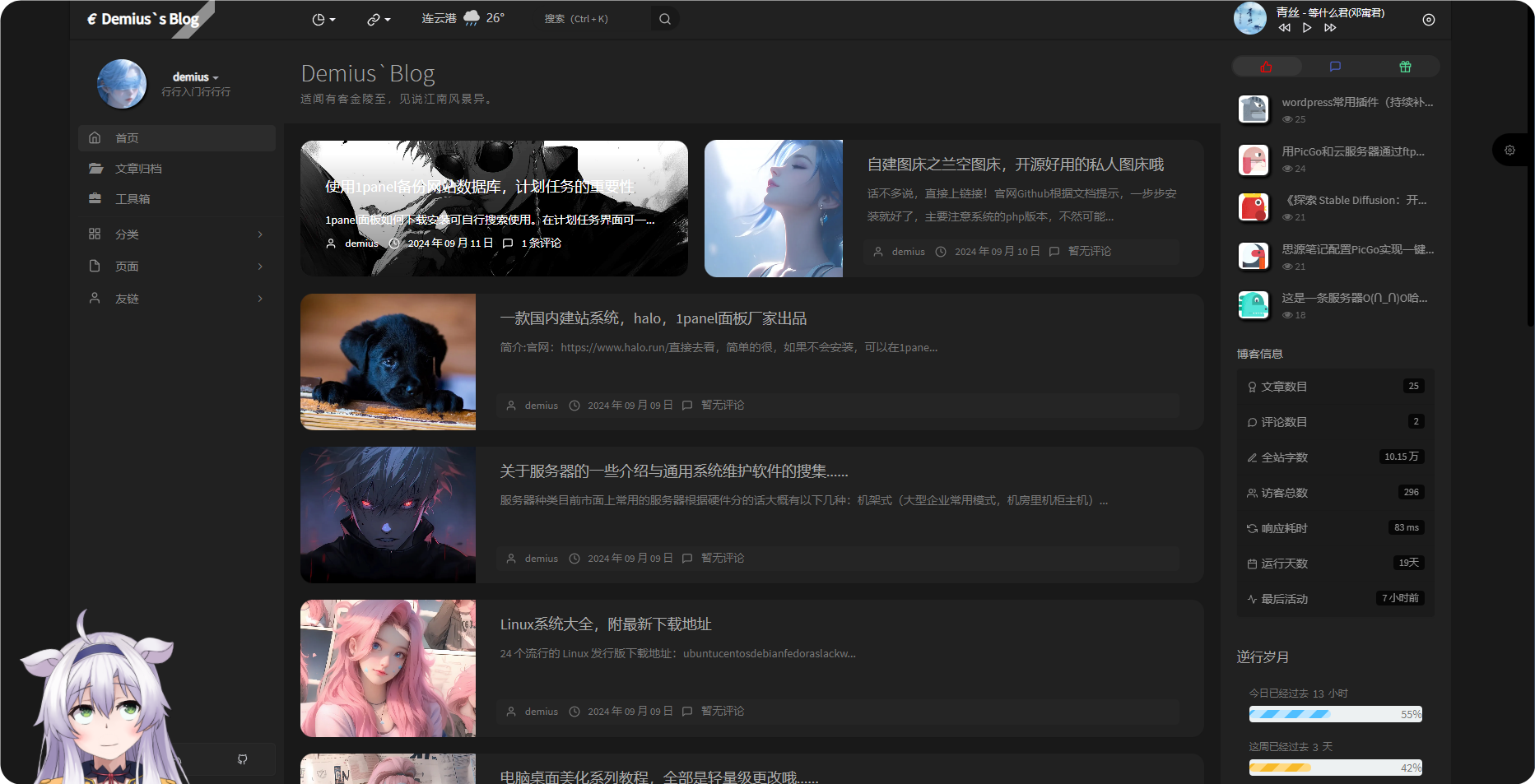
页面两侧框架留白间距
[collapse status=”false” title=”页面两侧框架留白间距”]
将页面扩大化了,看原版:

修改后:
代码:
1
2
3
4
5
6
7
8
9
10
11
12
13
14
15
16
17
18
19
20
21
22
23
24
25
26
27
28
29
30
31
32
33
34
35
36
37
38
39
40
41
42
43
44
45
| /*两侧框架留白间距*/
@media (min-width:1700px) {
.app.container {
width: 95%
}
.app.container .app-aside,
.app.container .app-header {
max-width: 95%
}
}
@media (min-width:2048px) {
.app.container {
width: 93%
}
.app.container .app-aside,
.app.container .app-header {
max-width: 93%
}
}
@media (min-width:1200px) {
.app.container {
width: 90%
}
.app.container .app-aside,
.app.container .app-header {
max-width: 90%
}
.app.container .app-footer-fixed {
max-width: 970px
}
.app.container.app-aside-folded .app-footer-fixed {
max-width: 1110px
}
.app.container.app-aside-dock .app-footer-fixed {
max-width: 90%
}
}
|
[/collapse]
文章标题居中
[collapse status=”false” title=”文章标题居中”]
1
2
3
4
| /*文章标题居中*/
header.bg-light.lter.wrapper-md {
text-align: center;
}
|
[/collapse]
首页标题文字居中
[collapse status=”false” title=”首页标题文字居中”]
1
2
3
4
5
| /*首页标题文字居中*/
.m-t-none.text-ellipsis.index-post-title.text-title
{
text-align:center !important;
}
|
[/collapse]
左上角博客LOGO/博客名称的扫光效果
[collapse status=”false” title=”左上角博客LOGO/博客名称的扫光效果”]
1
2
| /* logo扫光 */
.navbar-brand{position:relative;overflow:hidden;margin: 0px 0 0 0px;}.navbar-brand:before{content:""; position: absolute; left: -665px; top: -460px; width: 200px; height: 15px; background-color: rgba(255,255,255,.5); -webkit-transform: rotate(-45deg); -moz-transform: rotate(-45deg); -ms-transform: rotate(-45deg); -o-transform: rotate(-45deg); transform: rotate(-45deg); -webkit-animation: searchLights 6s ease-in 0s infinite; -o-animation: searchLights 6s ease-in 0s infinite; animation: searchLights 6s ease-in 0s infinite;}@-moz-keyframes searchLights{50%{left: -100px; top: 0;} 65%{left: 120px; top: 100px;}}@keyframes searchLights{40%{left: -100px; top: 0;} 60%{left: 120px; top: 100px;} 80%{left: -100px; top: 0px;}}
|
[/collapse]
左上角博主信息羽毛背景
[collapse status=”false” title=”左上角博主信息羽毛背景”]background:url后面括号里的网址就是羽毛动画的网址,你也可以把它保存下来放到自己网站的根目录的某个位置内,然后将网址改为自己的博客,防止该效果失效(也就是做了个备份的意思,当然如果你嫌麻烦也可以不做):
1
2
3
4
| /* 羽毛_css */
.dropdown.wrapper {
background:url(https://您的博客网址/yumao.webp) right bottom no-repeat;
}
|
[/collapse]
鼠标路过头像时放大并旋转
[collapse status=”false” title=”鼠标路过头像时放大并旋转”]
1
2
3
4
5
6
7
8
9
10
11
12
13
14
15
16
17
18
19
20
21
22
23
24
25
26
27
28
29
30
31
| /* 鼠标经过头像旋转放大 */
.img-circle {
border-radius: 50%;
animation: light 4s ease-in-out infinite;
transition: all 0.5s;
}
.img-circle:hover {
transform: scale(1.15) rotate(720deg);
}
@keyframes light {
0% {
box-shadow: 0 0 4px #f00;
}
25% {
box-shadow: 0 0 16px #0f0;
}
50% {
box-shadow: 0 0 4px #00f;
}
75% {
box-shadow: 0 0 16px #0f0;
}
100% {
box-shadow: 0 0 4px #f00;
}
}
|
[/collapse]
头像呼吸光环和鼠标悬停旋转放大
[collapse status=”false” title=”头像呼吸光环和鼠标悬停旋转放大”]
1
2
3
4
5
6
7
8
9
10
11
12
13
14
15
16
17
18
19
20
21
22
23
24
25
26
27
28
29
30
31
32
| .img-full {
width: 100px;
border-radius: 50%;
animation: light 4s ease-in-out infinite;
transition: 0.5s;
}
.img-full:hover {
transform: scale(1.15) rotate(720deg);
}
@keyframes light {
0% {
box-shadow: 0 0 4px #f00;
}
25% {
box-shadow: 0 0 16px #0f0;
}
50% {
box-shadow: 0 0 4px #00f;
}
75% {
box-shadow: 0 0 16px #0f0;
}
100% {
box-shadow: 0 0 4px #f00;
}
}
|
如果只需要单色呼吸光环,例如红色,可以将关键帧动画改为:
1
2
3
4
5
6
7
8
9
| @keyframes light {
from {
box-shadow: 0 0 4px #f00;
}
to {
box-shadow: 0 0 16px #f00;
}
}
|
[/collapse]
时光机内圆形头像
[collapse status=”false” title=”时光机内圆形头像”]
将独立页面-时光机里的头像都更改为圆形(原版是方形圆角样式):
1
2
3
| /* 时光机圆形头像 */
.img-square {border-radius: 50%;}
.list-group-item .thumb-sm .img-square {border-radius: 5px;}
|
[/collapse]
网站右侧滚动条样式
[collapse status=”false” title=”网站右侧滚动条样式”]
此处的 #949494;即为滚动条的颜色,你可以去 http://tools.jb51.net/static/colorpicker/ 这个链接去找到你喜欢的颜色然后替换
注意:替换的是 #后面的 6位数字,#不要动
1
2
3
4
5
6
7
8
9
10
11
12
13
14
15
16
17
18
19
20
21
| /* 美化网站右侧滚动条样式 */
/*定义滚动条高宽及背景 高宽分别对应横竖滚动条的尺寸*/
::-webkit-scrollbar {
width: 8px;
height: 6px
}
/*定义滚动条轨道*/
::-webkit-scrollbar-track {
background-color: transparent;
-webkit-border-radius: 2em;
-moz-border-radius: 2em;
border-radius: 2em
}
/*定义滑块 内阴影+圆角*/
::-webkit-scrollbar-thumb {
background-color: #949494;
background-image: -webkit-linear-gradient(45deg,rgba(255,255,255,.4) 100%,transparent 100%,transparent 50%,rgba(255,255,255,.4) 50%,rgba(255,255,255,.4) 75%,transparent 75%,transparent);
-webkit-border-radius: 2em;
-moz-border-radius: 2em;
border-radius: 2em
}
|
[/collapse]
首页文章图片获取焦点放大
[collapse status=”false” title=”首页文章图片获取焦点放大”]
1
2
3
4
5
6
7
8
9
10
11
12
13
14
15
16
17
18
| /* 首页文章图片获取焦点放大 */
.item-thumb{
cursor: pointer;
transition: all 0.6s;
}
.item-thumb:hover{
transform: scale(1.05);
}
.item-thumb-small{
cursor: pointer;
transition: all 0.6s;
}
.item-thumb-small:hover{
transform: scale(1.05);
}
|
[/collapse]
首页头图悬停放大并超出范围
[collapse status=”false” title=”首页头图悬停放大并超出范围”]
1
2
3
4
5
6
7
8
9
10
11
| .index-post-img {
overflow: hidden;
}
.item-thumb {
transition: all 0.3s;
}
.item-thumb:hover {
transform: scale(1.1)
}
|
[/collapse]
首页文章添加圆角效果
[collapse status=”false” title=”首页文章添加圆角效果”]
1
2
3
4
5
6
7
8
9
10
11
12
13
14
| /*首页文章版式圆角化*/
.panel{
border: none;
border-radius: 15px;
}
.panel-small{
border: none;
border-radius: 15px;
}
.item-thumb{
border-radius: 15px;
}
|
[/collapse]
博客头图阴影眼睛
[collapse status=”false” title=”博客头图阴影眼睛”]
1
2
3
4
5
6
7
8
9
10
11
12
13
14
15
16
17
18
19
20
21
22
23
| <html lang="en">
<head>
<meta charset="UTF-8">
<title>异次元鼠标经过文章Banner效果</title>
</head>
<style>
.entry-banner {background: #f4f4f4;width: 680px;height: 130px;clear: both;position: relative;display: block;border-radius: 8px;overflow: hidden}
.entry-banner a {border-radius: 8px;display: inline-block;width: 681px;height: 130px}
.entry-banner a img {-webkit-transition: all .2s;-moz-transition: all .2s;-ms-transition: all .2s;transition: all .2s}
.entry-banner a:before {position: absolute;top: 0;left: 0;z-index: 2;visibility: hidden;border-radius: 8px;width: 100%;height: 100%;background: #026dd4;content: '';opacity: 0;-ms-filter: "alpha(opacity=0)";-webkit-transition: all .4s;-moz-transition: all .4s;-ms-transition: all .4s;transition: all .4s}
.entry-banner a:after {position: absolute;top: 0;left: 0;z-index: 5;margin-top: 0;visibility: hidden;content: "";background-image: url(https://s2.ax1x.com/2019/06/11/VcwS8f.png);background-repeat: no-repeat;background-size: 101px 63px;background-position: center center;height: 130px;width: 100%;opacity: 0;-ms-filter: "alpha(opacity=0)";-webkit-transition: all .4s;-moz-transition: all .4s;-ms-transition: all .4s;transition: all .4s}
.entry-banner a:hover:before {visibility: visible;opacity: .75;-ms-filter: "alpha(opacity=75)"}
.entry-banner a:hover:after {visibility: visible;opacity: 1;-ms-filter: "alpha(opacity=100)"}
.entry-banner a:hover img {-webkit-transform: scale(1.08);-moz-transform: scale(1.08);transform: scale(1.08)}
</style>
<body>
<div class="entry-banner">
<a href="#">
<img border="0" width="680" height="130" src="https://img.iplaysoft.com/wp-content/uploads/2018/618-apps-sale/618_2019_banner.jpg" />
</a>
</div>
</body>
</html>
|
注意:这个效果本博还没测试过,蛮好玩的这里先收录一下了。
[/collapse]
文章内头图和图片悬停放大并超出范围
[collapse status=”false” title=”文章内头图和图片悬停放大并超出范围”]
1
2
3
4
5
6
7
8
9
10
11
12
| .entry-thumbnail {
overflow: hidden;
}
#post-content img {
border-radius: 10px;
transition: 0.5s;
}
#post-content img:hover {
transform: scale(1.05);
}
|
[/collapse]
修改h1,h2标题背景颜色
[collapse status=”false” title=”修改h1,h2标题背景颜色”]
1
2
3
4
| /*文章页h标签背景颜色修改*/
#post-content h1, #post-content h2 {
background : linear-gradient(to bottom,transparent 60%,rgba(0,191,255,.3) 0) no-repeat
}
|
[/collapse]
文章一二三四级标题美化
[collapse status=”false” title=”文章一二三四级标题美化”]
1
2
3
4
5
6
7
8
9
10
| /*文章一二三四级标题美化 开始*/
#post-content h1 {font-size: 30px}
#post-content h2 {position: relative;margin: 36px 0 20px!important;font-size: 1.55em;display: inline-block;}
#post-content h3 {font-size: 20px}
#post-content h4 {font-size: 15px}
#post-content h2::after {transition:all .35s;content:"";position:absolute;background:linear-gradient(#3c67bd8c 30%,#3c67bd 70%);width:1em;left:0;box-shadow:0 3px 3px rgba(32,160,255,.4);height:3px;bottom:-8px;}
#post-content h2::before {content:"";width:100%;border-bottom:1px solid #eee;bottom:-7px;position:absolute}
#post-content h2:hover::after {width: 2.5em;}
#post-content h1,#post-content h2,#post-content h3,#post-content h4,#post-content h5,#post-content h6 {color:#666;line-height:1.4;font-weight:700;margin:30px 0 10px 0}
/*文章一二三四级标题美化 结束*/
|
[/collapse]
文章版式阴影化
[collapse status=”false” title=”文章版式阴影化”]可能这个项目看名称比较晦涩,其实就是你现在看到的各个边框散发的蓝(色的)光效果。
所有 rgba后面的,如 26, 169, 255都可以进行修改,它代表的是散发出来的颜色类型。
你同样可以去 [http://tools.jb51.net/static/colorpicker/](在线颜色选择器 | RGB颜色查询对照表 (jb51.net) 这个网站去选自己喜欢的颜色,但更改的时候一定注意”标点”,不要出现类似少逗号的问题哦~:
1
2
3
4
5
6
7
8
9
10
11
12
13
14
15
16
17
18
19
20
21
22
23
24
| /* 首页文章版式阴影颜色 */
.panel{
box-shadow: 1px 1px 5px 5px rgba(26, 169, 255, 0.35);
-moz-box-shadow: 1px 1px 5px 5px rgba(26, 169, 255, 0.35);
}
.panel:hover{
box-shadow: 1px 1px 5px 5px rgba(26, 169, 255, 0.35);
-moz-box-shadow: 1px 1px 5px 5px rgba(26, 169, 255, 0.35);
}
.panel-small{
box-shadow: 1px 1px 5px 5px rgba(26, 169, 255, 0.35);
-moz-box-shadow: 1px 1px 5px 5px rgba(26, 169, 255, 0.35);
}
.panel-small:hover{
box-shadow: 1px 1px 5px 5px rgba(26, 169, 255, 0.35);
-moz-box-shadow: 1px 1px 5px 5px rgba(26, 169, 255, 0.35);
}
.app.container {
box-shadow: 0 0 30px rgba(26, 169, 255, 0.35);
}
|
[/collapse]
右侧列表导航栏图标颜色
[collapse status=”false” title=”右侧列表导航栏图标颜色”]这一项是更改右上方三个图标(大拇指,信息,礼物)的颜色,默认是白色。同样 #后面的六位数字代表颜色,可以改~
1
2
3
4
5
6
7
8
9
10
11
12
13
14
15
16
17
18
19
20
21
22
23
24
25
26
27
28
29
30
31
32
33
34
35
36
37
38
39
40
41
| /* 右侧列表导航栏图标颜色 */
.sidebar-icon svg.feather.feather-thumbs-up{color: #ff0000;}
.sidebar-icon svg.feather.feather-message-square{color:#495dc3;}
.sidebar-icon svg.feather.feather-gift{color:#52DE97;}
#post-content pre code {
display:block;
overflow-x:auto;
position:relative;
margin:0;
padding-left:50px;
}
pre code {
position:relative;
display:block;
overflow-x:auto;
margin:4.4px 0.px .4px 1px;
padding:0;
max-height:500px;
padding-left:3.5em
}
.img-square {
transition: all 0.3s;
}
.img-square:hover {
transform: rotate(360deg);
}
.glyphicon-fire {
color: #ff0000;
}
.nav-tabs-alt .glyphicon-comment {
color: #495dc3;
}
.glyphicon-transfer {
color: #0e5458;
}
|
[/collapse]
文章列表悬停上浮
[collapse status=”false” title=”首页文章列表悬停上浮”]
1
2
3
4
5
6
7
8
9
10
11
12
13
14
15
16
17
18
19
20
21
22
23
24
25
26
27
28
29
30
31
| /*首页文章列表悬停上浮*/
.blog-post .panel-small:not(article),
.blog-post .panel:not(article), .panel-picture {
transition: all 0.3s;
}
.blog-post .panel-small:not(article):hover,
.blog-post .panel:not(article):hover, .panel-picture:hover {
transform: translateY(-10px);
box-shadow: 0 8px 10px rgba(73, 90, 47, 0.47);
}
/*首页文章版式圆角化*/
.panel{
border: none !important;
border-radius: 15px !important;
}
.panel-small{
border: none;
border-radius: 15px;
}
.item-thumb{
border-radius: 15px 15px 0 0;
}
.border-radius-6 {
border-radius: 15px;
}
|
这段可能还需要改进,在目前这个主题版本中测试没有生效。
[/collapse]
赞赏按钮跳动
[collapse status=”false” title=”赞赏按钮跳动”]
1
2
3
4
5
6
7
8
9
10
11
12
13
14
| /*赞赏按钮跳动*/
.btn-pay {
animation: star 0.5s ease-in-out infinite alternate;
}
@keyframes star {
from {
transform: scale(1);
}
to {
transform: scale(1.1);
}
}
|
[/collapse]
页面两侧框架留白间距
[collapse status=”false” title=”页面两侧框架留白间距”]打开后台-更改外观-设置外观-开发者设置-复制代码粘贴至 自定义CSS即可:
1
2
3
4
5
6
7
8
9
10
11
12
13
14
15
16
17
18
19
20
21
22
23
24
25
26
27
28
29
30
31
32
33
34
35
36
37
38
39
40
41
42
43
44
45
| /*两侧框架留白间距*/
@media (min-width:1700px) {
.app.container {
width: 95%
}
.app.container .app-aside,
.app.container .app-header {
max-width: 95%
}
}
@media (min-width:2048px) {
.app.container {
width: 93%
}
.app.container .app-aside,
.app.container .app-header {
max-width: 93%
}
}
@media (min-width:1200px) {
.app.container {
width: 90%
}
.app.container .app-aside,
.app.container .app-header {
max-width: 90%
}
.app.container .app-footer-fixed {
max-width: 970px
}
.app.container.app-aside-folded .app-footer-fixed {
max-width: 1110px
}
.app.container.app-aside-dock .app-footer-fixed {
max-width: 90%
}
}
|
[/collapse]
评论边框
[collapse status=”false” title=”评论边框”]
1
2
3
4
5
6
7
| /*评论边框*/
.comment-parent {
margin: 20px;
padding: 20px;
border-radius: 25px;
border: 1px solid rgba(255,255,255,.3);
}
|
[/collapse]
底栏高度设置
[collapse status=”false” title=”底栏高度设置”]
1
2
3
4
5
| <!--底栏高度开始-->
.wrapper {
padding: 10px
}
<!--底栏高度结束-->
|
[/collapse]
粗斜体上色
[collapse status=”false” title=”粗斜体上色”]
1
2
3
4
5
6
7
8
| /* 粗斜体上色 */
strong{
color: #f26522;
}
em{
font-style: normal;
color: #fcaf17;
}
|
[/collapse]
开启全站变灰(黑白模式)
[collapse status=”false” title=”开启全站变灰(黑白模式)”]
1
2
3
4
5
| 这里编辑收缩框内容<!--开启黑白模式-->
html {-webkit-filter: grayscale(100%);filter:progid:DXImageTransform.Microsoft.BasicImage(graysale=1);}
html { filter:progidXImageTransform.Microsoft.BasicImage(grayscale=1); }
html{ filter: grayscale(100%); -webkit-filter: grayscale(100%); -moz-filter: grayscale(100%); -ms-filter: grayscale(100%); -o-filter: grayscale(100%); filter: url("data:image/svg+xml;utf8,#grayscale"); filter:progid:DXImageTransform.Microsoft.BasicImage(grayscale=1); -webkit-filter: grayscale(1);}
<!--黑白模式结束-->
|
[/collapse]
手机端不显示热门文章和标签云
[collapse status=”false” title=”手机端不显示热门文章和标签云”]
1
2
3
4
5
6
| /*手机不显示*/
@media (max-width:767px) {
#tabs-4,#tag_cloud-2 {
display: none;
}
}
|
[/collapse]
网站背景添加海浪背景
[collapse status=”false” title=”网站背景添加海浪背景”]
[tabs]
[tab name=”第一步” active=”true”]
添加至后台 主题设置-开发者设置-自定义CSS:
1
2
3
4
5
6
7
8
9
10
| /* 海浪背景CSS部分 */
#wavesDIV{position: fixed;bottom: 0;width: 100%;display:block;height:20vh;background-color:rgb(125,165,191);animation: move-out 2s cubic-bezier(0,.98,.97,1) forwards;}
.waves { position:relative; width: 100%; height:15vh; margin-top:-15vh; min-height:100px; max-height:150px; }
.parallax > use { animation: move-forever 25s cubic-bezier(.55, .5, .45, .5) infinite; }
.parallax > use:nth-child(1) { animation-delay: -2s; animation-duration: 7s; }
.parallax > use:nth-child(2) { animation-delay: -3s; animation-duration: 10s; }
.parallax > use:nth-child(3) { animation-delay: -4s; animation-duration: 13s; }
.parallax > use:nth-child(4) { animation-delay: -5s; animation-duration: 20s; }
@keyframes move-forever { 0% { transform: translate3d(-90px, 0, 0); } 100% { transform: translate3d(85px, 0, 0); } }
@keyframes move-out { 0% { transform: translateY(400%); } 100% { transform: translateY(0%); } }
|
[/tab]
[tab name=”第二步”]
添加至后台 主题设置-开发者设置-自定义输出head 头部的HTML代码:
1
2
3
4
5
6
7
8
9
10
11
12
13
14
| <!-- 海浪背景 -->
<div id="wavesDIV" style="display: block;">
<svg class="waves" xmlns="http://www.w3.org/2000/svg" xmlns:xlink="http://www.w3.org/1999/xlink" viewBox="0 24 150 28" preserveAspectRatio="none" shape-rendering="auto">
<defs>
<path id="gentle-wave" d="M-160 44c30 0 58-18 88-18s 58 18 88 18 58-18 88-18 58 18 88 18 v44h-352z"></path>
</defs>
<g class="parallax">
<use xlink:href="#gentle-wave" x="48" y="-2" fill="rgba(125,165,191,0.3)"></use>
<use xlink:href="#gentle-wave" x="48" y="3" fill="rgba(125,165,191,0.5)"></use>
<use xlink:href="#gentle-wave" x="48" y="5" fill="rgba(125,165,191,0.7)"></use>
<use xlink:href="#gentle-wave" x="48" y="12" fill="rgba(125,165,191,1)"></use>
</g>
</svg>
</div>
|
[/tab]
[/tabs]
[/collapse]